


In this article, we picked out the cards with the most bizarre illustrations around - from Pokémon to Trainers. We evaluated them according to their technique, bizarre style, and much more! This is our top 10 weirdest Pokémon arts.
This article was based on my opinion as a designer that studied art professionally. I'll highlight a few technical elements that bother me in these illustrations.
Top 10 Weirdest Card Arts
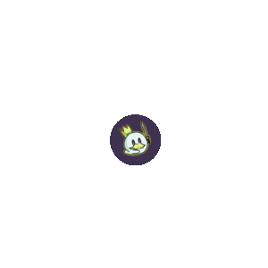
10 - Eevee-GX (Illustration Promo - Sun/Moon: #233)
Ad
This was the only artwork in all of Pokémon Company's professional history created by Q-rais.
This is an odd, forgettable way to see Eevee's face. It creates a disturbing sensation that doesn't match the image Eevee has. The Sun/Moon* promos featured prettier artworks that were released at the same time, so the community preferred them:
9 - Illustrations by Shigenori Negishi
I decided to add these two cards to our 9th spot.
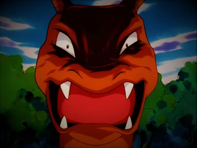
This artist's greatest problem is that they don't know anything about Pokémon anatomy or their proportions in general. Entei's body, for instance, seems shorter, as do its hind legs, which makes its figure quite odd. Besides this, the details on the background and the perspective regarding Entei and the volcanic scenery lack detail, so it fell quite flat.
If you compare this illustration with the Suicune in this same set, for instance, the difference is jarring. Suicune's illustration is incredibly detailed and respects perspective, Pokémon anatomy, and proportion:
The same issues I listed above apply to Blaziken VMAX CRE 201. The size of its claw is exaggerated - maybe the artist wanted to add more dynamic to the claw and make Blaziken itself really dominant, but their execution was poor. It just became odd compared to the rest of its body.
There's also the background below. The roof, where Blaziken is and where Inteleon, Drizzile, Sobble, and Zangoose are is confusing because its border is touching Blaziken, so it isn't as far away as it should be. It is touching its leg. The perspective is all wrong.
8 - Jerky Artworks - Pidgey, Pidgeotto, and Pidgeot ex (Scarlet/Violet: Obsidian Flames)
This artist started out strong with Lumineon V CRZ GG39, which was gorgeous because it had dynamic shapes, simple outlines and morphology. They carried on creating odd artworks that were still in their style, until they created this Pidgey evolution line. It literally looks as if they did it on Paint MS without any care for perspective or Pokémon proportion.
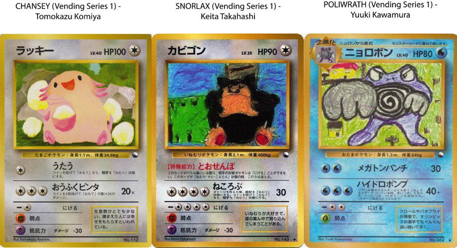
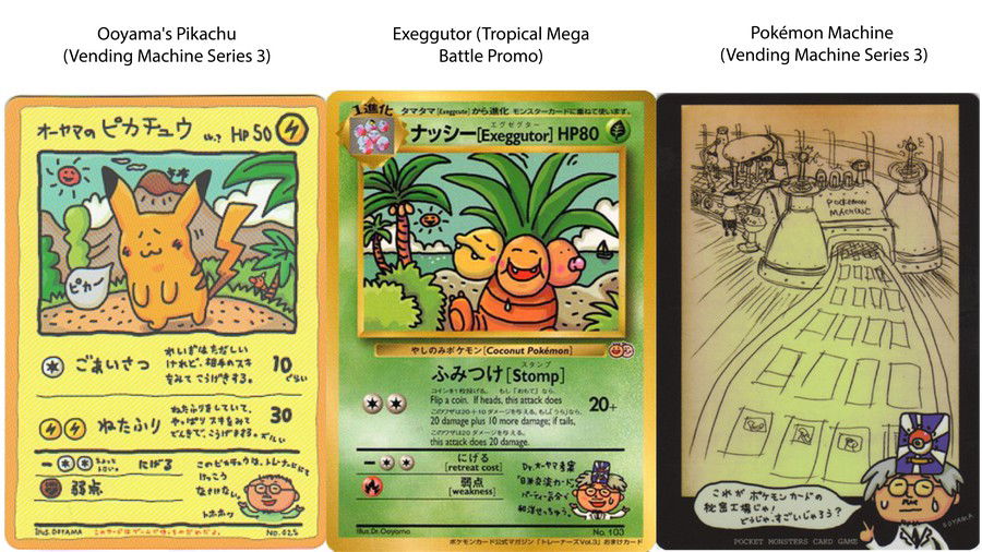
7 - Vending Machine Series (Japanese Sub Set)
This exclusive Japanese set from the early days of Pokémon TCG was available in vending machines that printed standard sheets of paper you could pull apart. This set had three parts.
To understand how this type of product works, here's a video by Poké Dak:
There were some pretty cards in this set, and unfortunately a few horrific illustrations as well. The Pokémon Company also held, at the same time, an "Illustration Contest" so the vending machines also printed the winning illustrations as well. This is the sum of it.
I'll add below three bizarre cards from this set:
Ad
As expected, there's this disproportionate, melted Chansey created by Tomozaku Komiya, besides the ones mentioned above. Keita Takahashi, which only created this Snorlax and nothing else, did so very poorly, without clearly outlining this Pokémon's limbs. Its background is also not great and doesn't make sense with the size of the Pokémon itself. Finally, there's Yuuki Kawamura, which apparently has a "childish" style.
6 - Miki Tanaka Illustrations
There's one card created by this artist which is very iconic: Larvitar sv3 203, from the Scarlet & Violet: Obsidian Flames set. Many consider this illustration quite reasonable. However, if you research their past works, you'll see this atrocity:
This Caterpie's eyes are empty. It looks like it has seen some disturbing things.
This artist has a deep history with the Pokémon Company and Creatures. They have worked with this franchise since the Fossil set (from the early days of the classic Base Set). However, their illustrations are quite odd, and the proportion of the Pokémon in their work just isn't right, as well as their anatomy. Take a look at this Machop line:
Furthermore, the first card this artist ever created, Slowpoke LC 93, is one of the most boring and empty illustrations in Pokémon TCG.
5 - Hama-Chan's Slowking (CoroCoro Promo Card)
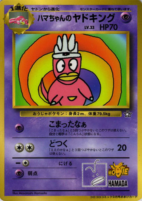
This was a limited edition card released by the "CoroCoro" magazine. It was released at the same time as the second Pokémon movie (Pokémon The Movie 2000: The Power of One). This artwork was created by the Slowking voice actor, Masatoshi Hamada, more popularly known for its artistic name, Hama-chan.
Maybe this career change wasn't the best idea for Masatoshi: this artwork is simply bizarre!
4 - Kouichi Ooyama Illustrations
Kouichi Ooyama is also one of the main pillars of the early days of Pokémon artworks, in Creatures - they also worked in the Vending Machine subset. These are their 3 worst artworks, in my opinion:
Additionally, they also designed a few cards in the Sun & Moon phase. Some important Trainers at the time were created with their art style:
There were a few other Trainers with this same art style, such as Acro Bike, Mysterious Treasure, Electropower, Electromagnetic Radar, and a few others. However, they weren't released in the West because this was the special set Tag All Stars.
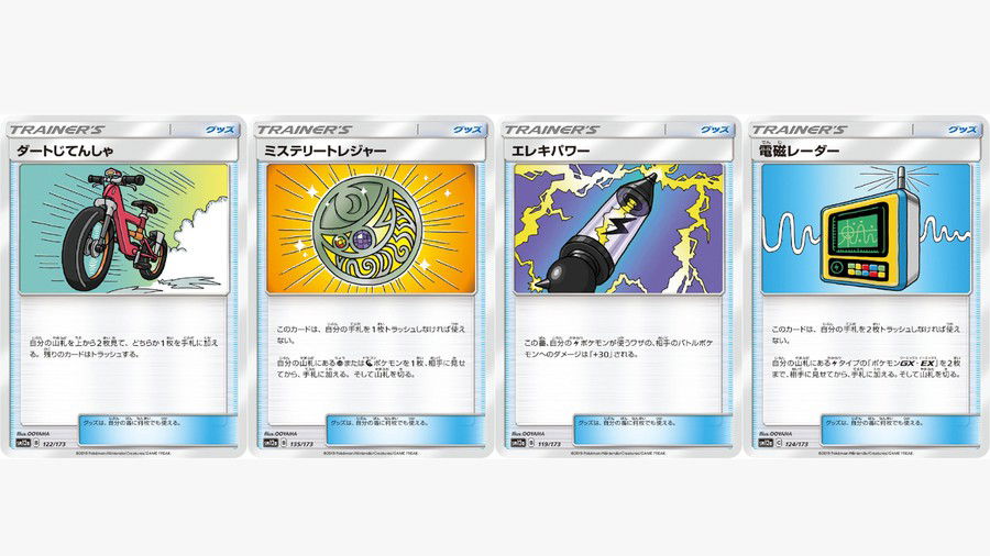
Among them, I confess that the first three I mentioned (Acro Bike, Mysterious Treasure, Electropower) were somewhat nicely made because of their "cartoon" style, but I don't truly enjoy this type of style.
Ad
3 - Tomokazu Komiya Illustrations
I added this artist to this list not just because of one card. It's their entire work and career, and particularly these three cards:
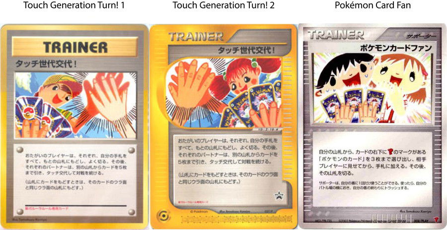
These were promotional cards from Japan. The first two ones were "P-Promo" cards, and the third last card was an "exclusive promotional" card from PLAY Promotional cards" given out at the Summer Battle Road* event, in 2003.
For instance, one of their most recent artworks from the Scarlet & Violet block truly bothered me lately. It's the Frigibax evolution line:
Baxcalibur sv2 210's background is too chaotic and there's a lot in the card itself. You can't make up what is happening and with whom. And that only gets worse if you are actually playing it and needs to read its text clearly.
This artist has worked with The Pokémon Company since the Base Set days, but Komiya has their own style and usually distorts Pokémon anatomy. They also tend to create irregular backgrounds.
Here are a few more examples:
And to think that they once created illustrations of Pokémon TAG TEAM, like the Sun & Moon promo, and an Illustration Rare for the Sword/Shield: Crown Zenith block:
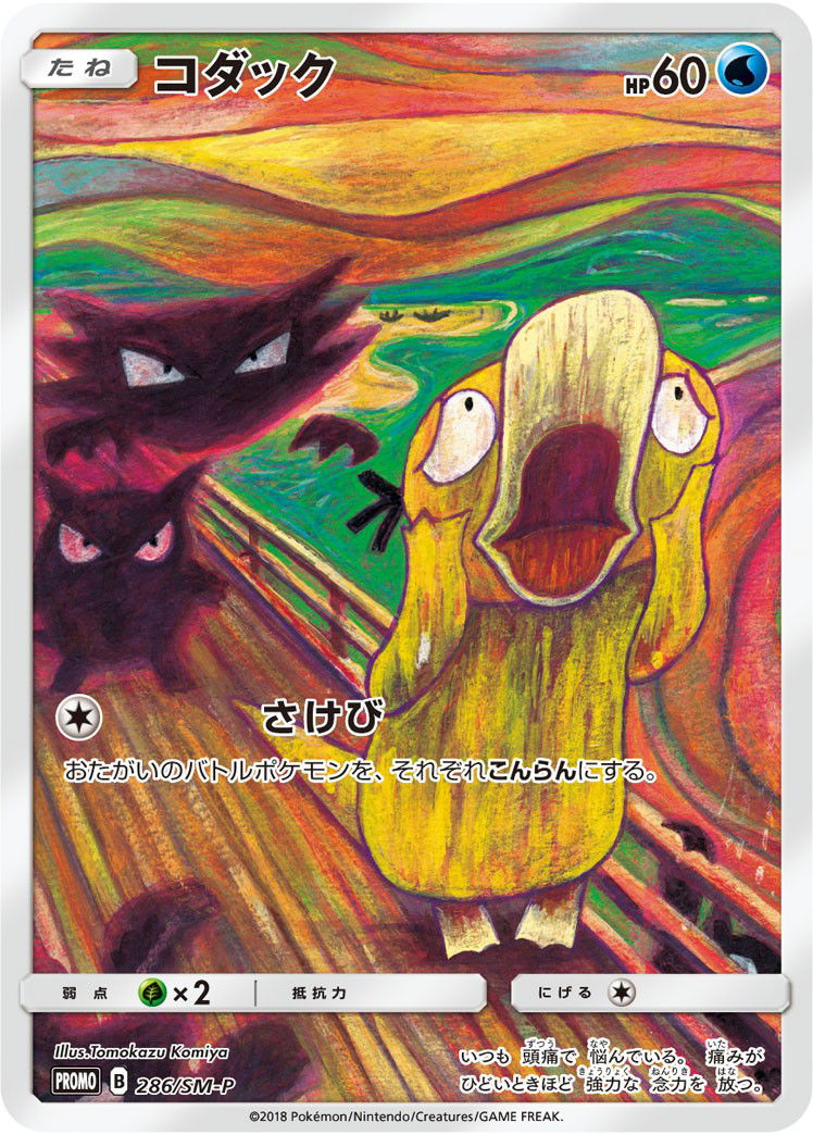
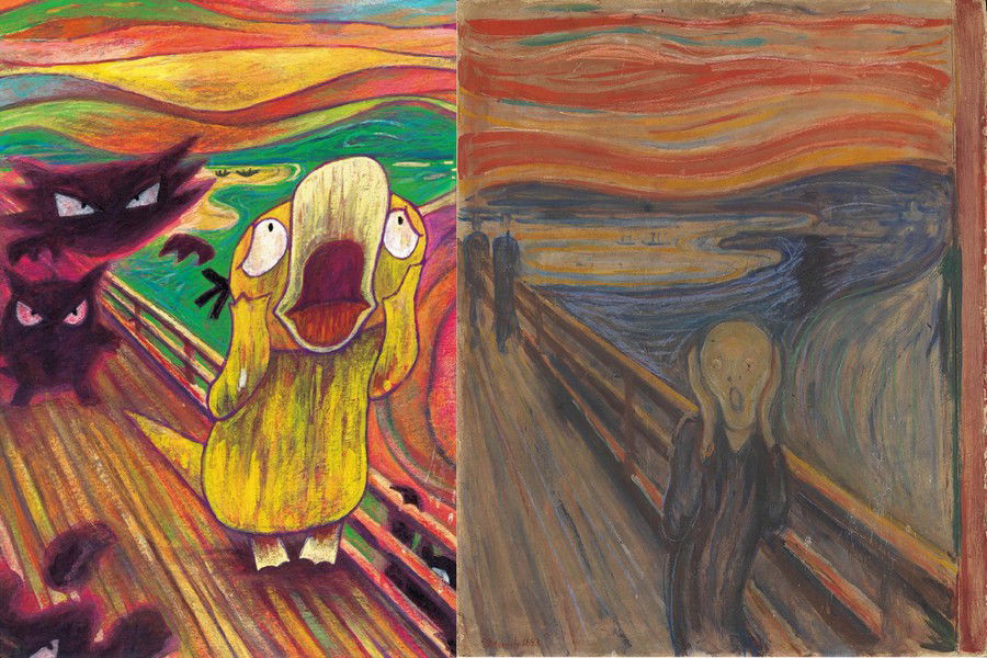
However, I'll be fair and give credit where it is due. A few rare times they created great artworks, such as the parody of the iconic "Scream" painting by Edvard Munch. This was a perfect blend of themes:
2 - Illustrations Related to Tomoaki Imakuni
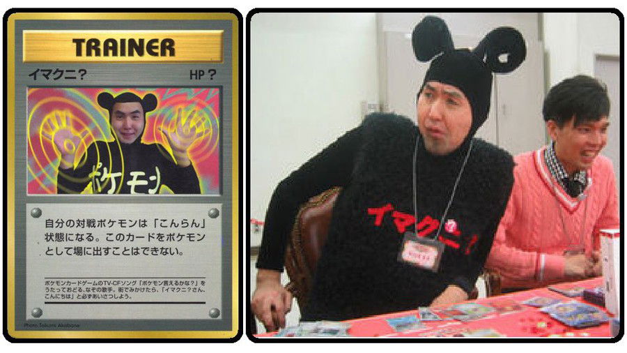
These artworks are only known in the east.
Imakuni is an influential personality in Japanese TV and music, but they're also a pillar of Creatures and have worked on many of their creative projects.
Even though they're one of the pioneers of this foundation, their cards are terrible and quite bizarre. They mostly weird out players and fans.
In the X/Y block, The Pokémon Company reprinted two cards from the sixth generation: Imakuni? GEN 63 and Imakuni?'s Doduo EVO 112.
Below you'll find all Trainer cards related to this artist. They are so odd I can't decide which one is worse:
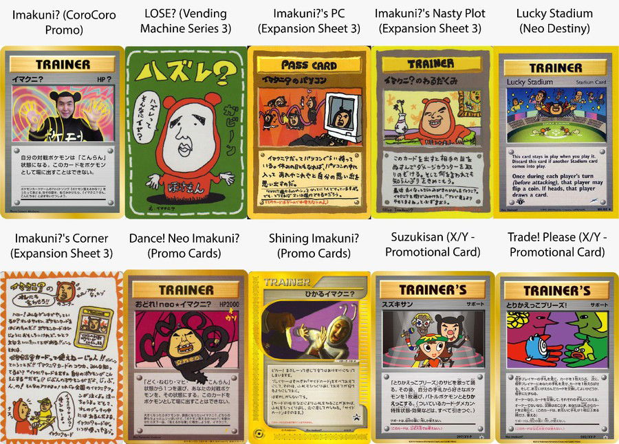
There's also the Whismur evolution line, only released in Japan, including Loudred and then Exploud, which are equally bizarre.
Ad
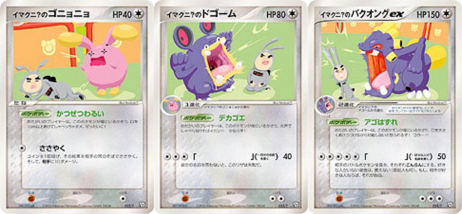
Ironically, they are good as an artist when they use their civil name, and not their artistic name. When they want to do something right, they can create incredible artworks. These are a few of their good cards:
Yes, they created the first illustration of Porygon from Wizards of the Coast's Base Set!
1 - Yu Nagaba Artworks
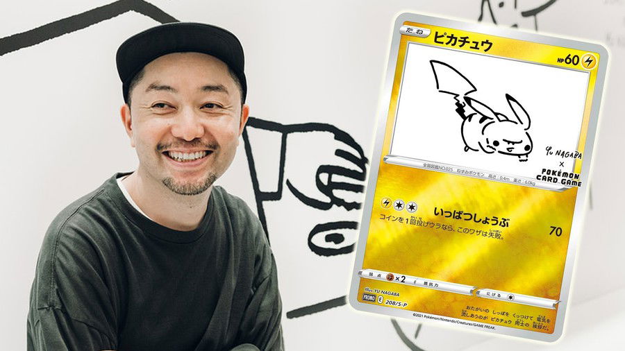
Yes! Our first place is controversial precisely because this celebrity is quite relevant in the art, entertainment, and design market. Some time ago, in 2021, they partnered with the Pokémon Company to create cards in their style. The most coveted cards from this partnership were eeveelutions:
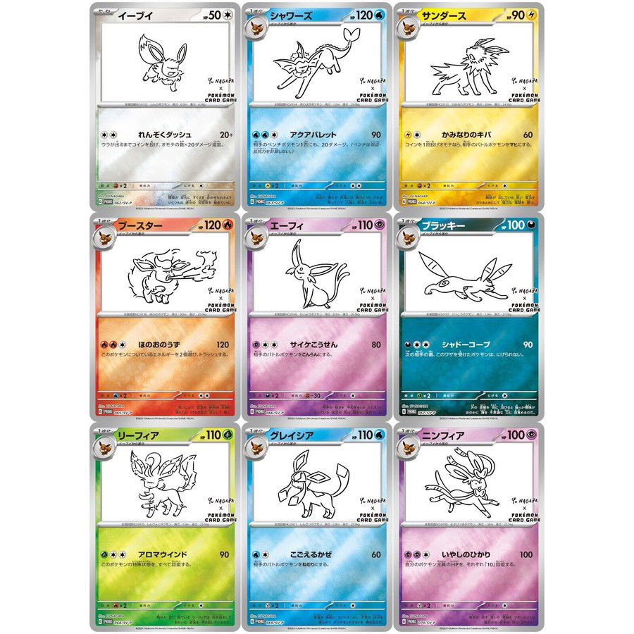
What bothers me the most is how minimalistic these illustrations are, considering how influential this artist is. I feel they needed a complex background, more shadow work and gorgeous colors. I expected more from someone who is so famous in the market.
I get that minimalism is their style, but some works require more details.
Honorable Mentions
Kanto Birds (Sun/Moon: Elite Trainer Box Promo Card)
This design is decent, but the artist didn't execute it all that well. Some pieces of the mosaic didn't fit well and didn't define the Pokémon properly. Like Moltres, which looks cross-eyed. Zapdos' wings are slightly shorter than they should be, and Articuno's head is too small.
They could have done this same mosaic design with just these bird's outlines, in a minimalistic style, which could be more interesting:
Deformed Charizards
Even though this is my favorite Pokémon, there are a few of its illustrations that bother me a bit.
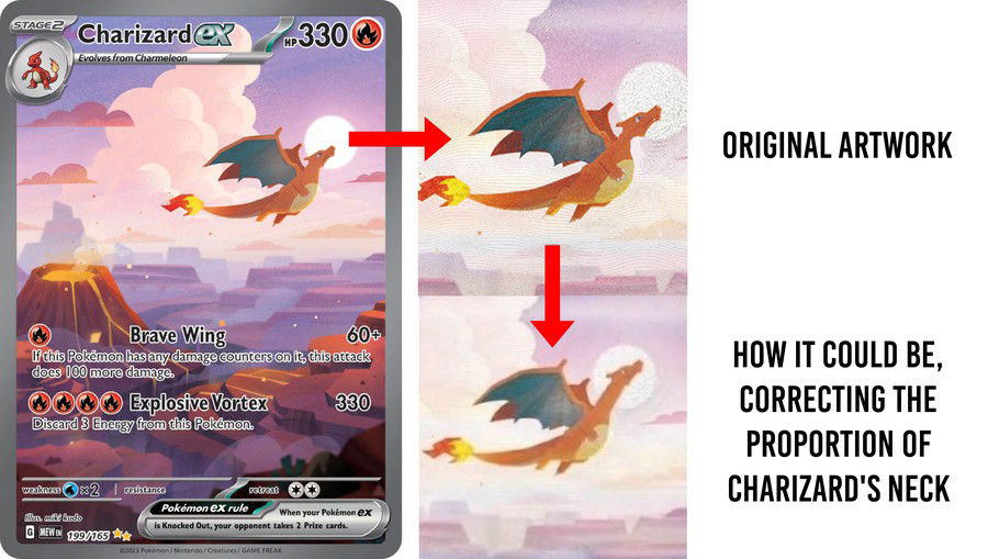
Charizard ex (Secret/Special Illustratrion Rare - Scarlet/Violet: 151)
Created by miki kudo, this evolution line was almost perfect! Both Charmander sv3pt5 168 and Charmeleon sv3pt5 169 were done gorgeously, but, when it was Charizard ex sv3pt5 199's turn, all went wrong. Its neck seems too short, which ruins its proportion.
Charizard ex (Ruby/Sapphire: Fire Red & Leaf Green)
This is another Charmander whose proportion isn't accurate. Its head is at the center as the focus point of the artwork to show how powerful its attack is, but, if we look closer at his body, we'll notice something odd. Its limbs are too short, which isn't proper Pokémon anatomy.
Ad
Final Words
What makes an illustration bad for you? Which cards deserved to be here and aren't? Tell us your thoughts in the comment section below!
Thank you for reading!
See you next time!


— Comments0
Be the first to comment